Karens have gotten a bad name in recent years, battered by memes painting them as rude, entitled, and constantly demanding to speak to the manager. The stereotype, which reflects societal conflict grounded in issues of gender, race, and age, was able to coalesce in the name “Karen” because of its popularity among parents of baby girls at a particular time.
Type “Karen” into Namerology’s invaluable NameGrapher, which visualizes U.S. baby name data from the past century and a half, and you can see the name spike into prominence in the 1950s and ’60s, then begin to fall out of favor almost as quickly. Karen had her moment among the top five baby girl names from 1957 to 1966—long enough ago for the name to now serve as a convenient repository for Americans’ most negative perceptions of boomer white women (even boomers in spirit).
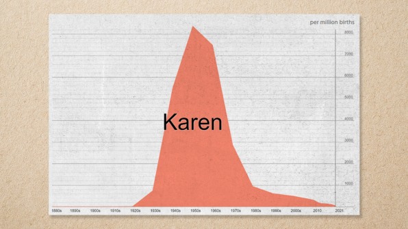 Such spikes in popularity may stem from new parents hitting upon a name that sounds original and appealing without realizing that many other parents, subconsciously tuned into the same cultural zeitgeist, were choosing the same name.
A similar pattern takes place in the world of logo design. Seemingly novel logo designs are adopted by companies in adherence to what marketing textbooks dictate: logos should function to differentiate. The result can be an outpouring of logos that may appear distinctive to their respective owners, but in fact resemble one another. And once that novelty of design wears off, those logos may come across as a little dated . . . much like the Karen name.
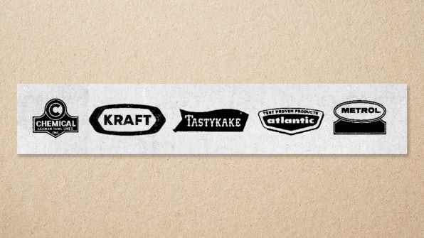 For instance, in the 1957-1966 era of peak Karen, polygons with one or more curved sides, such as the iconic Kraft logo, were used as design elements in American logos two and half times the rate of all the years prior to 1957 and from 1967 until now, according to data analysis from the United States Patent and Trademark Office. It’s unclear why there was such a preponderance of this particular shape in logos at that time—much like why the name Karen was so popular. If nothing else, chalk it up to the vagaries of fashion.
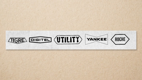 Meanwhile, the style of polygon borders could be called the “Heather” of the logo world. From 1974 to 1978, Heather was one of the top five baby girl names; and even into the ’80s, it ranked among the top 10, according to NameGrapher. During the same period, logos featuring polygon borders were popular, at a rate of more than two and a quarter times other periods. Like avocado refrigerators and Earth Shoes, these eccentric shapes, including the logo for Roche Pharmaceuticals, exude an unmistakable, and kind of funky, ’70s hip.
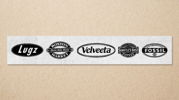 Logos with concentric oval elements might be considered the “Brandon” of the bunch. Before Brandon became part of a right-wing secret code followed by a left-wing meme, it was among the top 10 U.S. baby boy names from 1992 to 1998. During those same years, these logos with concentric ovals appeared 35% more often than in other years, resulting in a bumper crop of trademarks that today give off a serious mid-’90s vibe, including those for Boston Market and Seattle’s Best Coffee.
To some extent, these once-trendy polygon and oval logos may seem stuck in bygone eras. What to do, then, if your company’s logo is a Karen, a Heather, or a Brandon? While most people live out their lives with their given name, firms can more easily change logos if they choose, and the temptation can be strong to replace a Karen logo for a design more modern.
Yet, a case can be made for sticking with a long-standing logo. For one, it’s immediately recognizable as the brand. And two, a strong brand often can overcome even a seemingly dated logo or stereotypic style—much in the way singe-songwriter Karen O, for example, has used her unique style and personality to transcend any resemblance to Karenness.
Also, holding onto an iconic logo can pay off in the most distinctively classic sense. Consider the now iconic Coca-Cola script logotype. When it was designed in 1886, it reflected a common style of the day; now, it’s essentially the sole survivor of that style. Coke’s logo, then, is an “Ida,” a name that was seventh in popularity for baby girls in the 1880s before virtually disappearing. Today, it’s almost a one of a kind.
James I. Bowie is a sociologist at Northern Arizona University who studies trends in logo design and branding. He reports on his research at his website, Emblemetric.com.


